

The reallocation was already approved on paper. The scoring model said pull $180k from the loyalty app rebuild and push it into the fraud-detection workstream that was bleeding schedule. Finance had signed off on the mechanics. And yet the decision died in the room, because someone asked "so what's the actual downside if we don't?" and nobody had a single view that answered it. The meeting ended with "let's take it offline." Two weeks later the fraud team was still under-resourced and the loyalty rebuild had burned another sprint on work that was about to be de-prioritized.
That gap — between a decision that's technically ready and one the room can actually make — is almost always a presentation problem, not an analysis problem. That's exactly where executive trade-off visuals earn their keep for a PMO. This post is narrowly about one thing: the two-slide pattern that turns a stalled reallocation into a yes-or-no in a single sitting, plus the speaking notes and decision scripts that go with it.
Why reallocation decisions stall even when the numbers are done
Most reallocation decks are built for the analyst, not the approver. They show the model. They show the scoring. They show fifteen columns of cost-to-complete. And they assume the executive will do the synthesis in their head, in real time, while six other people are watching.
Executives don't stall because they lack data. They stall because they can't see the shape of the trade-off fast enough to feel safe committing. The stall usually sounds like one of these:
-
"What does this cost us if we're wrong?"
-
"Which projects are we actually starving to feed this one?"
-
"Is this reversible?"
If your slides don't answer those three questions in about ninety seconds, the safe move for the executive is to defer. Deferring costs them nothing personally. Approving something they don't fully understand costs them credibility if it goes sideways. So they defer — and your reallocation loses another two weeks.
The pattern holds pretty consistently: the more thorough the deck, the slower the decision. Twenty-slide reallocation packs generate more questions, more offline reviews, more "can you add a scenario for…" requests. Density reads as unfinished thinking, even when the thinking is airtight.
The two-slide pattern: impact vs cost, then risk vs reward
The fix is deliberately small. Two slides. Not two sections — two actual slides that carry the whole decision. Everything else goes in the appendix for people who want to dig.
Stop losing track of critical projects.
GoProjy helps you monitor, prioritize, and deliver projects on time—seamlessly.
- Unified portfolio visibility
- Real-time resource tracking
- Milestone & risk alerts
No credit card required
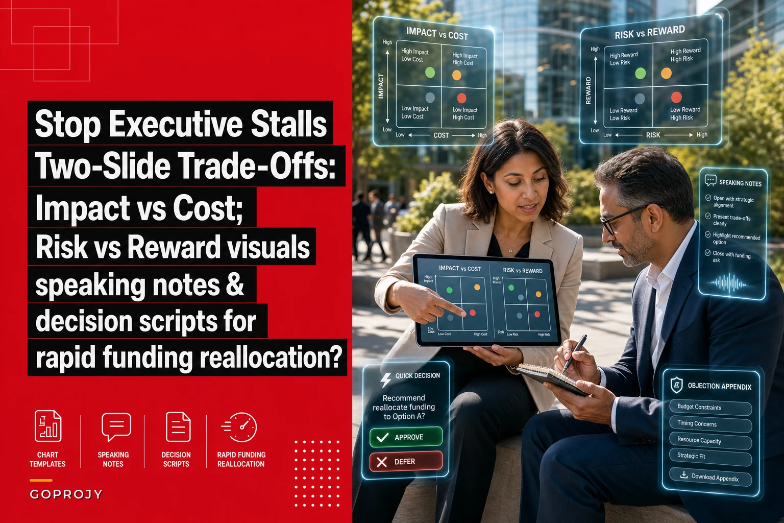
Slide one: Impact vs Cost. A scatter or quadrant view where each candidate project sits according to how much it moves the outcome you care about versus what it costs to get there. The reallocation shows up as arrows — money leaving low-impact/high-cost projects, money arriving at high-impact/lower-cost ones. The executive sees the direction of the money and the logic behind it in one glance.
Slide two: Risk vs Reward. Same candidates, different axes. Reward on one axis (expected benefit or benefit realization confidence), risk on the other (delivery risk, dependency risk, reversibility). This is the slide that answers "what if we're wrong." A project sitting high-reward but high-risk needs a different conversation than one that's high-reward, low-risk. When you show both slides back to back, the executive isn't just seeing that you want to move money — they're seeing that you've already thought about the failure case.
What goes on each axis (and what to leave off)
| Slide | X-axis | Y-axis | Bubble size / color | What NOT to add |
|---|---|---|---|---|
| Impact vs Cost | Cost to complete (or incremental spend) | Strategic impact / outcome contribution | Confidence in the estimate | Timeline, RAG status, owner names |
| Risk vs Reward | Delivery + dependency risk (composite) | Expected reward / benefit | Reversibility (color: green = reversible, red = one-way door) | Sprint velocity, resource counts, historical spend |
The temptation is always to encode more. Resist it. Every extra dimension you add to a quadrant is one more thing the executive has to decode before they can decide. The bubble-size and color slots are the only extras that consistently help, because they answer the two most common follow-up questions ("how sure are you?" and "can we undo this?") without requiring a new chart.
The speaking notes that carry the slides
A trade-off visual with no narration invites the room to interpret it themselves, and interpretation is where meetings go sideways. The speaking notes exist to steer, not to explain the axes.
Here's the structure that keeps things moving — and notice how short it is. This is the whole script for slide one:
-
Name the move in one sentence. "We're recommending moving $180k from loyalty-rebuild to fraud-detection this quarter."
-
Point to the arrow, not the data. "These two projects are down here — high cost, low near-term impact. This one's up here — that's where the money's going."
-
Pre-empt the top objection. "Before you ask
yes, loyalty still ships, just a quarter later. Nothing on the roadmap dies."
-
Hand off to slide two. "The next slide is the 'what if we're wrong' view."
Four beats. The mistake most PMO leads make is narrating the methodology ("we weighted these five factors and normalized…"). Nobody in the room wants the methodology in the room. They want it in the appendix, available if challenged. Leading with method signals you're not confident in the recommendation.
For slide two the speaking note has a different job — it's about de-risking the yes:
-
"The project we're funding is high-reward and, importantly, it's green here — it's reversible. If it doesn't pan out in a quarter, we stop and reclaim what's left."
-
"The project we're pulling from is low-risk to pause. We're not creating a new problem by doing this."
-
"So the downside case is
we lose a quarter of loyalty progress. The upside case is we stop the fraud bleed before it becomes reportable."
The reversibility framing is probably the most underused move in reallocation pitches. Executives approve reversible decisions much faster than irreversible ones, because a reversible decision is cheap to be wrong about. If your funding move can be unwound, say so out loud and color it green on the slide.
The decision script: getting to yes or no before the meeting ends
The visuals get you to the moment of decision. The decision script gets you through it. Without one, the meeting drifts into "let's think about it," which is where reallocations go to rot.
A decision script is a short, pre-written set of prompts that force a clean outcome. You run it after slide two:
-
The direct ask "I'm asking for approval to move the $180k this week. Can I get a yes or a no today?"
-
The conditional branch "If it's not a full yes — what's the one thing you'd need to see to make it a yes?"
-
The parking-lot cap "If we need more analysis, let's name exactly what and set a decision date now — not 'offline.'"
That third prompt matters more than it looks. "Take it offline" with no date is how a two-week decision becomes a two-month one. Forcing a decision date, even when the answer is "not yet," keeps the reallocation alive.
The conditional branch also gives you something useful: the specific missing piece. More often than not it's one thing — "I want to see what happens to the loyalty benefits case if we delay a quarter" — not a wholesale rework. You can often answer it right there from the appendix. If your appendix is built well, a good chunk of those "let's take it offline" moments collapse into "actually, that's on slide 14, here."
When this two-slide approach actually makes sense
This pattern is built for a specific situation: a reallocation where the analysis is genuinely done and the bottleneck is the decision, not the data. It works best when:
-
You're moving money between existing funded projects, not proposing something net-new.
-
The steering committee is time-boxed and over-scheduled.
-
You've been burned before by decks that generated more questions than answers.
If the situation matches those conditions, the two-slide pattern is a compact, repeatable way to accelerate funding moves without sacrificing rigor.
When it's a bad idea
The two-slide pattern is a decision accelerant, not an analysis substitute. It's the wrong tool when:
-
The underlying prioritization scoring is contested. If the room doesn't trust how impact was scored, no chart fixes that — you need the scoring conversation first. That's a separate exercise, and it's worth doing the work to link prioritization scores to funding slices before you ever build the trade-off visuals.
-
The decision is a genuine one-way door with regulatory or contractual weight. Those deserve the full pack and a slower cadence.
-
You're using visuals to paper over a recommendation you're not confident in. Executives pick up on that fast, and a clean quadrant makes the confidence gap more obvious, not less.
When any of those conditions apply, do the heavier work first. The two slides accelerate a good decision; they don't manufacture one.
Who should not run this
If you're a PMO lead who doesn't own the reallocation recommendation — if you're presenting someone else's numbers you can't fully defend — don't run the decision script.
The direct ask ("yes or no today") only works when you can handle follow-up questions without deferring. Running the script from a position of shaky ownership just exposes the gap in the most public possible setting.
A real scenario: fintech PMO, quarterly steering committee
A mid-size fintech PMO managing around 40 active projects kept losing reallocation decisions to the same pattern. Their standard funding-move deck ran 18–22 slides. Average time from "recommendation ready" to "money actually moved" was close to three weeks, because most reallocations bounced through two or three meetings before getting approved.
They rebuilt one reallocation — the fraud-vs-loyalty move above — into the two-slide pattern with speaking notes and a decision script. The appendix carried all the old detail. The reallocation cleared in a single 20-minute agenda slot, with one clarifying question answered live from appendix slide 11.
Over the next two quarters they ran roughly a dozen reallocations this way. Decisions that used to take 2–3 meetings mostly resolved in one, and the "take it offline with no date" ending — which had basically been the default — dropped to something like one in five. Not perfect. But the money moved weeks earlier, which for a schedule-slipping fraud workstream was the whole point.
The interesting side effect: the appendix got better. Because the front two slides carried the decision, the team stopped padding the main deck and started curating the appendix into a proper reference — the charts most likely to answer the top three objections, in order.
How the two slides connect to your regular governance rhythm
These trade-off visuals aren't a standalone artifact you build from scratch every time. They pull directly from the health signals you're already tracking. The impact-vs-cost positioning comes from your cost-to-complete and outcome data; the risk-vs-reward slide comes from your delivery-risk and benefits-confidence signals.
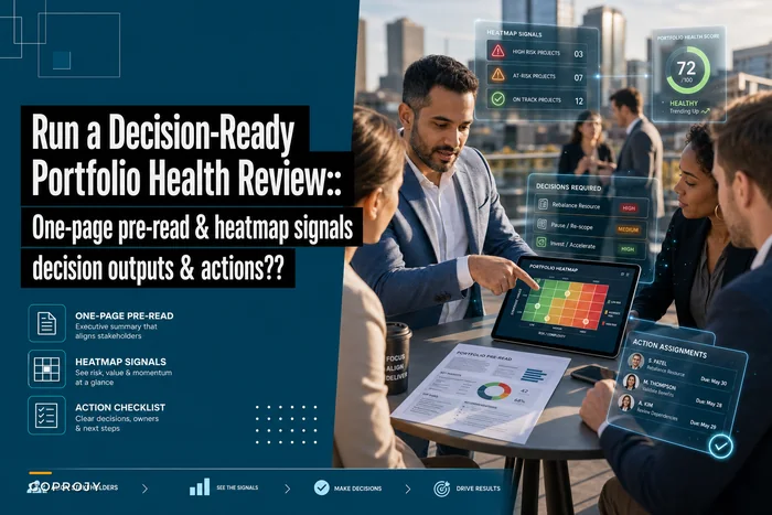
If you already run a tight portfolio review, you're most of the way there — the trade-off slides are really just a decision-focused cut of the same underlying data you'd pull together for a decision-ready portfolio health review. The workflow end to end looks roughly like this:
-
Your health review surfaces a project that's underperforming or a workstream that's starved.
-
You identify the reallocation candidate pairs.
-
You pull their existing impact, cost, risk and reward data into the two quadrant templates.
-
You draft the four-beat speaking notes and the decision script.
-
You pre-position the top three likely objections in the appendix.
-
You get 20 minutes on the steering agenda and run it.
If the data's already flowing from your regular reporting, building the two slides is closer to an hour than a day. That's not a small thing — it means the format is sustainable enough to actually use every cycle, not just when someone has bandwidth to build a custom deck.
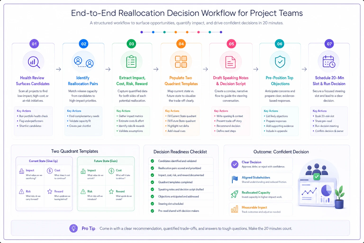
A quick visual like this helps teams standardize the steps and handoffs across cycles.
The one habit that makes all of this stick
Build a reusable template for both slides — fixed axes, fixed color coding for reversibility, fixed bubble-size meaning — and don't redesign it every cycle. The value compounds when executives recognize the format. By the third time they see your impact-vs-cost quadrant, they already know how to read it, which means the comprehension window shrinks and the conversation goes straight to the decision.
Lock axes and color coding across cycles so executives learn the format and decisions speed up.
That familiarity also raises the bar for what gets brought to the table. When the format is standardized, a weak recommendation becomes more obvious — the arrows don't tell a clear story, the reversibility dots are all red, the reward axis looks thin. The template becomes a forcing function for better analysis, not just better presentation.
Reallocation speed isn't about having more analysis than the room can absorb. It's about presenting exactly enough for the room to see the shape of the trade-off, feel confident the downside is contained, and say yes before the meeting runs out.
Two slides, four spoken beats, one direct ask. Everything else lives in the appendix, ready but out of the way.
Ready to elevate your project delivery?
Join over 2,500 project teams using GoProjy to optimize resources, reduce risks, and drive portfolio success.