

Most PMO dashboards fail in one of two ways. Either every project glows red by Thursday and people stop looking, or the thresholds are so loose that a project only turns red the week it actually dies. Both come from the same root cause: someone copied threshold values from a template built for a company that looks nothing like theirs.
A 40-project portfolio in a 300-person firm needs different trip wires than a 400-project portfolio in a 12,000-person enterprise. Yet the SPI < 0.9 = amber rule gets pasted into both, and nobody questions it until the alerts have already lost credibility.
This post is about getting the numbers right — the actual calibration work behind KPI threshold calibrations PMO teams rely on. Not the philosophy of KPIs, not another lecture on choosing the right metrics. Just the thresholds, how to validate them before you ship them, and what to do when the underlying data isn't clean enough to trust. There's a downloadable deck of presets at the end organized by org size and type, but the reasoning matters more than the numbers, so read first.
The specific failure: thresholds set by vibes, not by distribution
Here's the pattern. A PMO lead stands up a new portfolio dashboard. They need thresholds for SPI, CPI, milestone variance, resource utilization, and a handful of others. They don't have historical data yet — or they have it but never looked at the actual spread. So they default to round, intuitive-feeling numbers:
-
SPI below 0.95 = amber, below 0.90 = red
-
Budget variance over 10% = red
-
Utilization above 85% = red
Feels reasonable. Then reality hits. In a consulting shop where project estimates are deliberately padded, SPI naturally hovers around 1.05–1.15, so a project at 0.97 is actually in trouble — but your amber doesn't fire until 0.95. Meanwhile, in an R&D-heavy org where schedules slip by design during discovery phases, half the portfolio sits below 0.90 permanently and your red band is useless noise.
The threshold wasn't wrong in some absolute sense. It was wrong for that distribution. A threshold only means something relative to how the metric actually behaves in your environment.
What shows up across a lot of portfolios is that nobody looks at the histogram before setting the band. They set the band, then spend six months explaining away false alarms until the whole early-warning system quietly dies.
Calibrate against the distribution, not the ideal
The fix is simple to describe and slightly annoying to do: pull 6–12 months of the metric's actual values across your portfolio, look at where it clusters, and set thresholds based on percentiles rather than aspirations.
Stop losing track of critical projects.
GoProjy helps you monitor, prioritize, and deliver projects on time—seamlessly.
- Unified portfolio visibility
- Real-time resource tracking
- Milestone & risk alerts
No credit card required
-
Collect the raw metric history for every active and recently-closed project. You want at least 30–40 data points per metric or the percentiles are meaningless.
-
Plot the distribution. Even a crude histogram in a spreadsheet tells you whether the metric is tight or sprawling.
-
Set amber at roughly the 25th percentile of "bad direction" and red at around the 10th. If SPI below 1.0 is "behind," find the value where only the worst ~10% of your projects fall and make that red.
-
Sanity-check against known outcomes. Take three projects everyone agreed were in trouble last year. Did your proposed red band catch them? If not, loosen or tighten.
-
Document the "why" next to each number. Six months from now someone will ask why red is 0.88 and not 0.90, and "because the 10th percentile was 0.88" is a real answer.
The percentile approach isn't magic. In a very young portfolio with no history you simply won't have the data, and you'll fall back to presets — that's what the deck is for. But the moment you have real numbers, recalibrate. The preset is a loan, not a permanent fixture.
If you have fewer than ~30 data points, treat the preset as a temporary starting position and mark the threshold for review once more history accumulates.
One thing worth sitting with: the healthier your portfolio actually is, the tighter your red band should be. A portfolio where everything runs at SPI 1.0–1.1 should flag a 0.96 as a genuine problem. A noisy portfolio needs wider bands just to stay readable. Copying thresholds between the two guarantees one of them is miscalibrated.
Here's a quick visual of the calibration workflow.
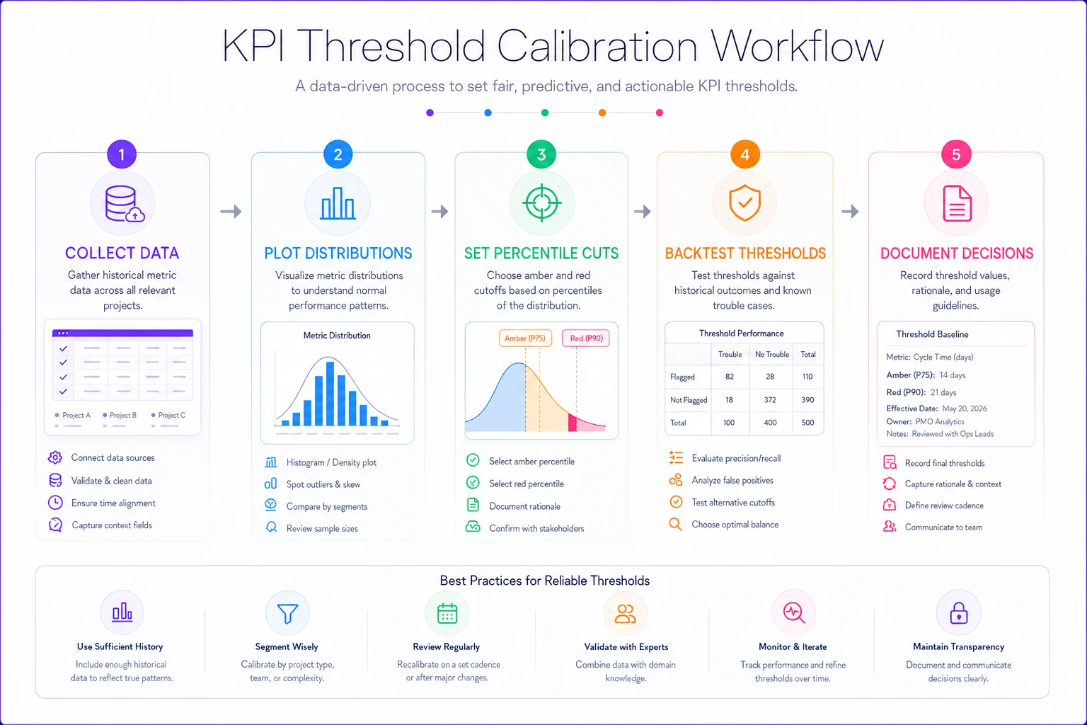
The preset is a loan, not a permanent fixture — recalibrate as soon as you have reliable history.
Thresholds change with org size and type — here's the shape of it
The preset deck is organized along two axes: org size and delivery type. Both change how metrics behave and how fast you can respond.
Size affects aggregation. In a small portfolio, one bad project moves the portfolio-level KPI significantly, so you want project-level alerts to do the heavy lifting and keep portfolio thresholds loose. In a large portfolio, individual noise washes out, so portfolio-level trends become meaningful and you can tighten them.
| Metric | Small org (<50 projects) | Mid org (50–200) | Large org (200+) | Notes by type |
|---|---|---|---|---|
| SPI amber / red | 0.92 / 0.85 | 0.94 / 0.88 | 0.95 / 0.90 | Tighten both bands ~0.03 for consulting/estimate-padded shops |
| CPI amber / red | 0.93 / 0.87 | 0.95 / 0.90 | 0.96 / 0.92 | R&D/discovery work: widen red to ~0.85 early-phase |
| Milestone slip (days) | 5 / 10 | 7 / 14 | 10 / 21 | Regulated/capital projects tolerate longer slips before red |
| Utilization | 80% / 90% | 82% / 90% | 85% / 92% | Shared specialist pools: drop red to ~85% to protect burnout margin |
| Open risk aging | 14 / 30 days | 10 / 21 | 7 / 14 | Compliance-driven orgs: compress aggressively |
Notice the direction of travel. Larger orgs generally run tighter portfolio thresholds because aggregation smooths noise. Smaller orgs run looser portfolio bands and lean harder on project-level signals. This is the opposite of what a lot of people assume — they think big enterprises need loose bands because they're complex. Complexity at the portfolio level actually buys you statistical stability.
Validation protocols: prove the threshold works before you trust it
A threshold you haven't validated is a guess with a decimal point. Before any preset goes live, run it through a quick validation pass. This is the part almost everyone skips, and it's the part that separates an alert system people trust from one they ignore.
Backtest against known history. Take the last 12 months of project outcomes. Replay your proposed thresholds against that historical data as if the alerts had been running. Count two things:
-
True catches projects that genuinely went bad and would have tripped red before the trouble was obvious.
-
False alarms projects that tripped red but were actually fine.
A usable threshold catches most of the real problems with a tolerable false-alarm rate. There's no universal right ratio, but a rough field heuristic: if more than about a third of your red alerts turn out to be noise, the band is too tight and people will tune it out. If you're missing more than a quarter of genuine failures, it's too loose.
Check lead time. An alert that fires the same week a project collapses is technically accurate and operationally worthless. Measure how many days of warning each threshold actually gives. If your SPI red band only trips when recovery is already impossible, you need a leading indicator instead — this is exactly the trend-based logic covered in designing low-noise early-warning triggers for schedule slippage, where the signal is the direction and velocity of change, not just the current value.
Validate the input data. A threshold is only as good as the number feeding it. If your SPI is calculated from status fields that project managers update inconsistently, no amount of calibration saves you. Confirm that each metric is sourced from a reliable, consistently-updated field before you tune its band. The foundational work of getting those inputs trustworthy is its own project — building a portfolio KPI data model and governance system covers why clean inputs have to come first.
Run this validation whenever you change a threshold, not just at launch. Thresholds drift out of calibration as the portfolio changes.
Fallback rules: what to do when the data is missing or junk
This is the part most threshold decks ignore entirely, and it's where real portfolios actually break. Your calibration assumes clean, current data. In practice, on any given Monday, some projects haven't updated their status in two weeks, a feed from the time-tracking system failed overnight, or a new project has no baseline yet.
What should the alert do then? If you don't define this, the dashboard will silently show green for a project that simply has no data — which is the single most dangerous false signal a PMO can produce. "No news is good news" is exactly backwards in portfolio reporting.
-
Stale data = its own alert state. If a metric hasn't been refreshed within its expected cadence (say, 7 days for weekly-reported projects), flag it grey or hatched — explicitly "unknown," never green.
-
Missing baseline = suppress the metric, not the project. A project without a cost baseline shouldn't show CPI green. Show CPI as "not yet measurable" and keep the project visible with a setup flag.
-
Partial data = widen the band. If you only have three data points, don't trust a tight percentile. Fall back to the generic preset for that org size until enough history accumulates.
-
Broken feed = hold last known + timestamp. When an upstream system fails, display the last valid value with its age shown, so nobody mistakes a frozen number for a current one.
-
Define who gets paged on a data failure vs. a project failure. These are different problems routed to different people. A dead feed is for the data owner; a red SPI is for the delivery lead.
The grey "unknown" state is the one people resist most, because it makes the dashboard look less tidy. But a dashboard that honestly says "I don't know about these six projects" is far more trustworthy than one that paints them green by default.
A real scenario: recalibrating a noisy mid-size portfolio
A professional-services firm running about 90 active client projects had a portfolio dashboard where roughly 60% of projects showed amber or red at any given time. Leadership had stopped opening it. The PMO was manually re-explaining status in weekly meetings, which defeated the entire point of having a dashboard.
The diagnosis was straightforward once someone pulled the distributions. Their SPI thresholds were the out-of-the-box 0.95/0.90, but because they padded estimates, the portfolio's natural SPI median sat around 1.08. A project at 0.96 — perfectly healthy for them — was tripping amber constantly. Meanwhile a project drifting from 1.08 down to 1.00 was genuinely decaying but never flagged, because it stayed above 0.95.
They recalibrated against their actual distribution: amber moved to around 1.00, red to about 0.93, both now anchored to real percentiles rather than textbook defaults. They added a trend rule so a project losing more than ~0.08 SPI over three reporting periods flagged regardless of absolute value. And they introduced the grey "stale" state for anything not updated in a week.
Over the following quarter, the share of projects showing amber or red dropped from roughly 60% to somewhere around 20–25%. More importantly, the reds that did fire corresponded to projects that actually needed intervention. Leadership started opening the dashboard again. Nothing about the metrics changed. Only the calibration did.
When this makes sense, and when it doesn't
When distribution-based calibration is worth it: You have at least a few months of reasonably clean metric history, a portfolio large enough that percentiles mean something (roughly 30+ projects), and alerts that people have already started ignoring. That last one is the strongest signal — tuned-out alerts almost always trace back to miscalibrated bands.
When to just use the presets: Brand-new PMO, new tooling, or a portfolio too small for meaningful statistics. Grab the org-size preset from the deck, ship it, and commit to recalibrating once you have around 40 data points. Don't over-engineer calibration for eight projects.
Who should not touch this yet: If your underlying metric inputs are unreliable — inconsistent status updates, broken feeds, no agreed definitions — fix that first. Calibrating thresholds on top of dirty data just produces a very precise wrong answer. Get the data model trustworthy, then tune the bands.
Using the preset deck
The downloadable deck includes threshold presets for the common PMO metrics — SPI, CPI, milestone variance, utilization, risk aging, benefit variance — broken out by org size (small / mid / large) and delivery type (agile-heavy, waterfall/capital, continuous-ops, consulting). Each preset card includes the suggested amber/red bands, a note on when to tighten or loosen, the validation checklist to run before go-live, and the fallback rules for missing or stale data.
Treat the presets as a starting position with an expiry date. The whole point of calibration is that your numbers eventually come from your portfolio, not from a deck. The deck just gets you to a sane default fast, and gives you the validation protocol so the first version isn't a pure guess.
The teams that get KPI threshold calibrations PMO right aren't the ones with the fanciest dashboards. They're the ones who checked the distribution before setting the band, backtested before trusting it, and decided — explicitly — what the alert should do when the data goes quiet. That last decision is the one that saves you, because the data always goes quiet eventually.
Ready to elevate your project delivery?
Join over 2,500 project teams using GoProjy to optimize resources, reduce risks, and drive portfolio success.