

Three months ago, I walked into a PMO office where the director had seventeen different dashboards open across two monitors. Excel sheets, PowerBI reports, project management tools, custom databases. She was trying to figure out why their portfolio health score showed green while three major initiatives were about to miss critical milestones.
This wasn't a tools problem. It was a data architecture problem.
The metrics that matter versus the data that distracts
Most organizations collect mountains of project data but can't answer basic questions like "which programs are actually at risk?" or "what's our true capacity utilization?" They have the information. They just never designed a proper metrics taxonomy and data model to turn raw status updates into actionable intelligence.
The difference between PMOs that scale successfully and those that drown in complexity comes down to how they structure their portfolio data from day one. Not just what metrics they track, but how those metrics connect, aggregate, and flow through the organization.
Why portfolio metrics fail at scale
Most PMOs start simple. Track project status, budget variance, timeline adherence. Makes sense when you're managing 10-15 projects. Something breaks around 40-50 concurrent initiatives.
Stop losing track of critical projects.
GoProjy helps you monitor, prioritize, and deliver projects on time—seamlessly.
- Unified portfolio visibility
- Real-time resource tracking
- Milestone & risk alerts
No credit card required
The first crack appears in aggregation logic. A program manager needs to roll up five project statuses into one program health score. Do you average them? Weight by budget? By strategic importance? Nobody documented the rule, so different managers calculate differently. Executive dashboards show conflicting numbers depending on who pulled the report.
Then comes the dimension problem. Finance wants metrics sliced by cost center. Operations needs them by business unit. Strategy wants them by strategic objective. Sales wants them by customer segment. Each team builds their own tracking sheet with slightly different definitions. A "delayed" project means two weeks late in one system, four weeks in another.
Alert fatigue hits next. Every metric gets a threshold. Every threshold triggers a notification. Suddenly you're getting 200 alerts per week, 95% noise. The five critical warnings get buried. Teams start ignoring all alerts. Real problems slip through.
What really kills portfolio visibility is data contract failures. The project management tool exports "percent complete" as a decimal. The BI system expects a percentage. Someone changes a field name during a system update. An integration breaks silently. For three weeks, your KPIs show stale data and nobody notices until a project implodes.
Building a metrics taxonomy that actually works
Your portfolio KPI system isn't just a list of metrics. It's a hierarchical data model with clear relationships and inheritance rules.
Delivery metrics track execution health. Schedule variance, milestone completion rates, velocity trends. These metrics cascade from task level to project to program to portfolio.
Resource metrics monitor capacity and allocation. Utilization rates, skill gaps, bench strength. These aggregate from individual contributors up through teams, departments, and the full organization.
Financial metrics cover budget performance, cost efficiency, ROI tracking. They flow from work packages through projects to programs, with different aggregation rules at each level.
Risk metrics quantify uncertainty and exposure. Risk scores, mitigation effectiveness, issue aging. These require special handling because risks don't aggregate linearly—ten small risks don't equal one large risk.
Value metrics measure business impact and benefits realization. Customer satisfaction scores, operational improvements, strategic objective completion. These often lag and require careful attribution logic.
The taxonomy determines your aggregation pathways. A project's schedule variance rolls up to program level weighted by project budget. But risk scores might use maximum values instead of averages—a program is only as healthy as its riskiest project.
Each metric needs clear dimensional rules. Can you slice schedule variance by geography? By project type? By sponsor? Define these dimensions upfront, not when someone asks for a new report three months later.
Fact versus dimension: the architecture nobody talks about
Every data point in your portfolio KPI system is either a fact or a dimension. Getting this wrong destroys your ability to analyze performance patterns.
Facts are measurable, numeric values that change over time. Project percent complete. Budget spent. Resources allocated. Defects discovered. These are things you sum, average, or calculate.
Dimensions are descriptive attributes you filter and group by. Project type. Business unit. Project manager. Technology stack. Region. Priority level. These provide context for your facts.
The confusion starts when something could be either. Is project status a fact (represented as a number: 1=green, 2=yellow, 3=red) or a dimension (a category to filter by)? Is resource allocation a fact (hours assigned) or dimensional (which team)?
If you would ever sum or average it, it's a fact. If you filter or group by it, it's a dimension. Some data serves both roles—track them separately.
This distinction drives your entire data model. Facts live in narrow, tall tables with timestamps. Dimensions live in wide tables with rich attributes. Facts change frequently. Dimensions change rarely.
A biotech PMO I worked with mixed these concepts. They stored project phase as a numeric fact (1=planning, 2=execution, 3=closing). When they tried to calculate average phase across the portfolio, they got meaningless decimal values. Worse, when phases were renumbered to add new stages, historical reports broke.
Your fact/dimension model determines what questions you can answer. Poor separation means you can't properly filter, aggregate, or trend your KPIs. You end up with that seventeen-dashboard situation—lots of data, no insights.
Aggregation rules that preserve signal through noise
Raw project data rarely tells the portfolio story. You need aggregation logic that maintains meaningful signals as data rolls up the hierarchy.
The naive approach averages everything. Ten projects with schedule variances of -5%, -10%, +2%, -3%, -8%, +1%, -4%, -6%, -2%, -7% average to -4.2% portfolio variance. Looks manageable. Except one of those projects is a $50M strategic initiative and another is a $200k internal tool upgrade. The average treats them equally.
Weighted aggregation seems smarter. Weight by budget, by resources, by strategic score. But this introduces new problems. A massive infrastructure project with tiny schedule variance can mask multiple smaller projects in crisis. The portfolio looks healthy while customer-facing initiatives burn.
The solution is composite aggregation rules that change based on context and level:
-
At project-to-program level, use weighted averages for financial metrics but maximum values for risk scores
-
At program-to-portfolio level, create buckets before aggregating
-
Time-based aggregation needs special handling for different review cycles
-
Context-specific rules for different project categories
Pro-tip: document and version aggregation rules alongside data contracts so rollups are auditable and reproducible.
A program inherits the highest risk from its projects—you can't average away danger.
Instead of one portfolio health score, maintain separate aggregates for strategic initiatives, operational projects, and maintenance work. Different project types need different tolerance thresholds.
Monthly variance might average daily values, but quarterly reviews might use point-in-time snapshots from month-end. Missing this distinction creates confusion when numbers don't reconcile.
Consider a 120-project portfolio across eight programs. Each program has different aggregation needs. Customer-facing programs weight by revenue impact. Infrastructure programs weight by dependency count. Research programs weight by strategic alignment score. Compliance programs use strictest variance (maximum deviation).
These rules must be documented, versioned, and accessible. When someone asks why the portfolio dashboard shows yellow despite most projects being green, you need a clear answer.
Alert thresholds: finding signal in the noise
A venture-backed SaaS company I worked with had 47 different alert rules in their portfolio system. Their PMO team received roughly 300 notifications per week. Guess how many they actually investigated? Maybe five.
Alert fatigue kills portfolio governance. The opposite—no alerts—means problems hide until they explode. The key is progressive thresholds with context awareness.
| Threshold Level | Action | Recipients | Response Required |
|---|---|---|---|
| Information | Logged only | System audit trail | None |
| Warning | Notify PM | Project manager only | Monitor, no action |
| Action | Escalate | Program manager | Response within 24 hours |
| Critical | Executive alert | Portfolio board | Immediate intervention |
Static thresholds miss context. A two-week delay means something different for a three-month project versus a two-year program. A 10% budget overrun on a $10k project is different from the same percentage on a $10M initiative.
Dynamic thresholds adjust based on project phase, size, type, and historical performance. A digital transformation program with $8M budget enters execution phase. The system automatically adjusts thresholds: schedule variance tightens to ±1 week from ±2 weeks in planning. Budget variance drops to ±5% from ±10%. Resource utilization narrows to 85-95% from 70-90%.
The system also tracks threshold breaches over time. Three yellow alerts in two weeks triggers orange. Repeated orange escalates to red. This catches gradual degradation that static thresholds miss.
One pattern to avoid: hair-trigger thresholds on calculated metrics. If your "efficiency index" combines five raw metrics, small changes in each can trigger massive swings in the calculated value. Either smooth the calculation or widen the threshold.
Data contracts: the unglamorous foundation
The best metrics taxonomy means nothing if your data pipelines break every other week. Data contracts—formal agreements about data structure, format, and quality—keep your portfolio KPI system reliable.
A project management tool update changes "PlannedEndDate" to "TargetCompletionDate". Nobody notices for three weeks. Suddenly your schedule variance calculations show every project as on-time because the formula references a field that no longer exists.
Data contracts define field names and types, required versus optional fields, valid value ranges, update frequency, and transformation rules.
-
Project Status Extract
-
Source
ProjectToolAPI v2.3
-
Frequency
Daily at 2am EST
-
Fields
-
ProjectID
string, required, format: "PROJ-YYYY-NNNN"
-
StatusDate
date, required, format: "YYYY-MM-DD"
-
PercentComplete
decimal, required, range: 0.00-1.00
-
BudgetSpent
decimal, optional, range: ≥0
-
RAGStatus
string, required, values: ["Red","Amber","Green"]
These contracts become versioned agreements between systems. When the project tool wants to change a field, they publish a new contract version with a migration timeline. Your KPI system has time to adapt.
Contracts go beyond structure. They include quality rules. No project can show >100% complete. Budget spent cannot exceed budget allocated by >20%. Status date cannot be more than 7 days old. All projects must have an assigned PM.
When contract violations occur, the system flags them before they corrupt your KPIs. A project showing 150% complete gets quarantined for investigation, not averaged into your portfolio metrics.
PMOs without data contracts spend 30-40% of their time fixing data issues, reconciling numbers, and explaining why last week's report shows different historical values than this week's.
The human side of metrics governance
Even perfect data architecture fails without governance processes that people actually follow.
The typical mistake: overwhelming documentation that nobody reads. A 200-page data governance manual gathering dust while teams make up their own rules. Embed governance into daily workflows instead.
Make metric definitions accessible at point of use. When someone hovers over "Schedule Performance Index" in a dashboard, they see the formula, not just the number. When they click deeper, they get examples and edge cases.
Create clear ownership chains. Every metric needs a business owner (defines meaning and use), technical owner (maintains calculation), and data steward (ensures quality). These aren't committee roles. They're individual responsibilities with names attached.
Regular calibration sessions keep definitions aligned. Monthly, gather key stakeholders to review metrics showing unusual patterns, proposed definition changes, new metrics requests, and retirement of unused metrics.
A manufacturing PMO I worked with ran these sessions like code reviews. Project managers presented their metric interpretations. Peers challenged assumptions. The group aligned on edge cases. This prevented drift where different teams slowly evolved different definitions.
The governance board shouldn't be a bureaucracy. Three to five people maximum. Decisions in days, not weeks. If adding a new metric takes two months of committee meetings, people build shadow systems.
When operational software solves the integration nightmare
Modern AI-powered operational platforms make a massive difference here. Instead of manually stitching together data from twelve different tools, these systems create unified data models automatically.
The AI components handle the tedious parts—recognizing that "PlannedEnd" and "TargetDate" probably mean the same thing, flagging when percentage values are stored as decimals versus whole numbers, identifying outlier data that likely indicates errors.
More importantly, they enforce consistency without human intervention. When a project manager updates status in one place, the system automatically propagates that update through all dependent metrics, applies the appropriate aggregation rules, checks against thresholds, and maintains audit trails.
The real value isn't replacing human judgment—it's eliminating the manual data wrangling that consumes 40% of PMO time. Your team focuses on interpreting insights and making decisions, not fixing broken formulas and chasing missing data.
These platforms also solve the version control nightmare. When you need to change an aggregation rule or adjust a threshold, you update it once centrally. The system handles deploying that change across all reports, dashboards, and alerts. No more discovering six months later that half your project managers are using an old calculation.
A practical implementation roadmap
Month 1: Core metric definition
Pick 5-7 essential portfolio KPIs. Not 50. Define facts, dimensions, and aggregation rules for just these metrics. Document in simple tables, not elaborate frameworks.
Month 2: Data model and contracts
Build the data structure for your core metrics. Create contracts with primary data sources. Set up basic quality checks. Keep it simple—this isn't the final architecture.
Month 3: Aggregation and thresholds
Implement aggregation logic. Start with simple rules, monitor results, adjust based on anomalies. Set conservative thresholds—better to under-alert initially than overwhelm teams.
A visual summary of this roadmap:
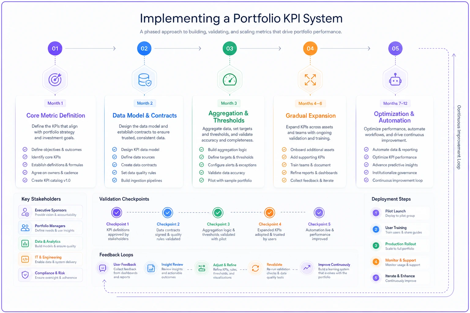
Month 4-6: Gradual expansion
Add metrics in waves. Five to seven per month maximum. Each wave goes through the full cycle: definition, data model, aggregation, thresholds. Learn from each iteration.
Month 7-12: Optimization and automation
Refine based on usage patterns. Which metrics do people actually check? Which thresholds trigger useful actions? Automate repetitive calculations and reports.
A renewable energy company followed this approach for their 200-project portfolio. Started with schedule variance and budget performance. By month six, they had fifteen reliable KPIs replacing chaos of spreadsheets. By year-end, their portfolio reviews took one hour instead of four.
The difference reliable KPIs make
When your portfolio KPI system actually works, the entire PMO dynamic changes.
Status meetings stop being defensive exercises where everyone explains why their numbers look different. Portfolio reviews focus on decisions, not data reconciliation. Executives trust the dashboards instead of demanding custom reports.
Project managers start managing differently too. When they know their metrics roll up accurately, they're more honest about project health. No more gaming the system because the system is transparent and fair.
The real test comes during crisis. When a major program starts degrading, your KPIs catch it early. The right people get alerted. The impact on related initiatives is immediately visible. Response time drops from weeks to days.
Perhaps the biggest change is cognitive load reduction. Your PMO team stops spending mental energy on whether the numbers are right. They focus on what the numbers mean and what to do about them.
Building this system isn't glamorous work. Defining data contracts and aggregation rules doesn't generate excitement like launching new initiatives. But it's the difference between a PMO that scales successfully and one that drowns in its own complexity.
The portfolio KPI system you build today determines whether you can manage 50 projects next year or 500. Design it thoughtfully. Govern it actively. Let operational software handle the integration complexity. Your future PMO will thank you for the investment.
Ready to elevate your project delivery?
Join over 2,500 project teams using GoProjy to optimize resources, reduce risks, and drive portfolio success.